ux design / ui design / illustrations / color palette / typography
Project Overview
Client: Beijeped
Industry: Menstrual Care
Location: Turkey
Services Provided: UX/UI Design, Visual Identity Elements
The Challenge
Beijeped needed a website that would resonate with their target audience: women looking for sustainable and comfortable menstrual care solutions. The goal was to create an online experience that was as soothing and reliable as the products they offer. This required a seamless user journey, an inviting color palette, and illustrations that spoke to the brand's ethos.
Our Approach
Our design journey began by deeply understanding Beijeped's mission and their users' needs. Here’s how we brought their vision to life:
1. UX/UI Design: We started with extensive user research to map out the user journey, ensuring every interaction on the website would be intuitive and delightful.
User Flow: We created clear and simple navigation to help users easily find information about products, subscriptions, and educational content on menstrual health.
Wireframes and Prototypes: Using Figma, we designed wireframes and interactive prototypes, focusing on user-friendly layouts and accessible design.
2. Visual Identity Elements: Creating a cohesive visual identity was crucial for Beijeped to stand out and connect with their audience on an emotional level.
Typography: We selected a clean and elegant typeface that reflects the brand's modern and caring nature. The chosen fonts ensure readability and create a welcoming feel.
Color Palette: The color scheme is a blend of soothing neutral tones. Soft pinks and gentle neutrals evoke a sense of comfort and warmth.
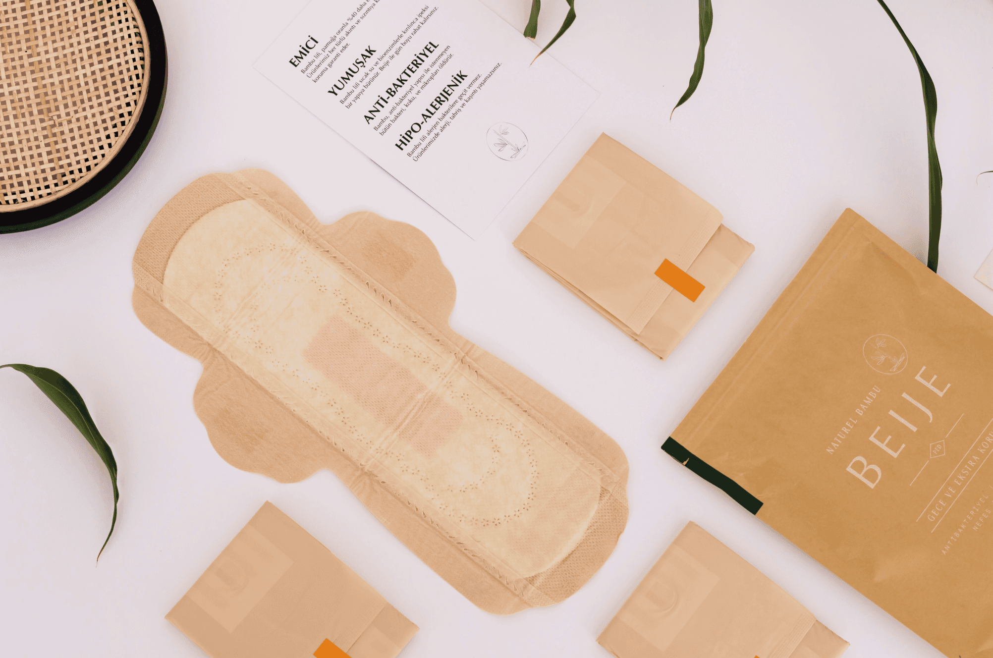
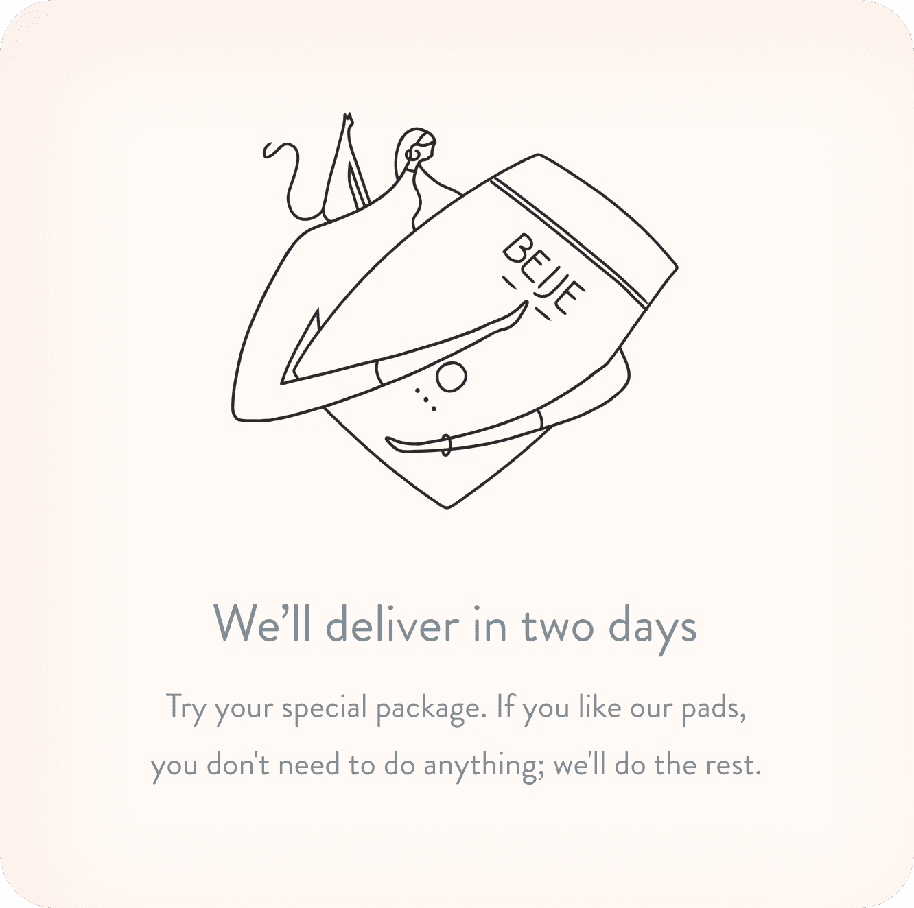
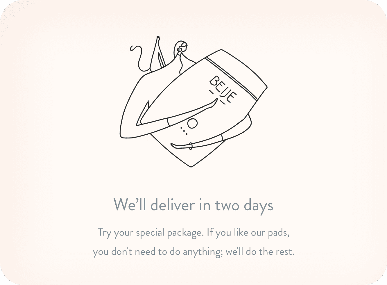
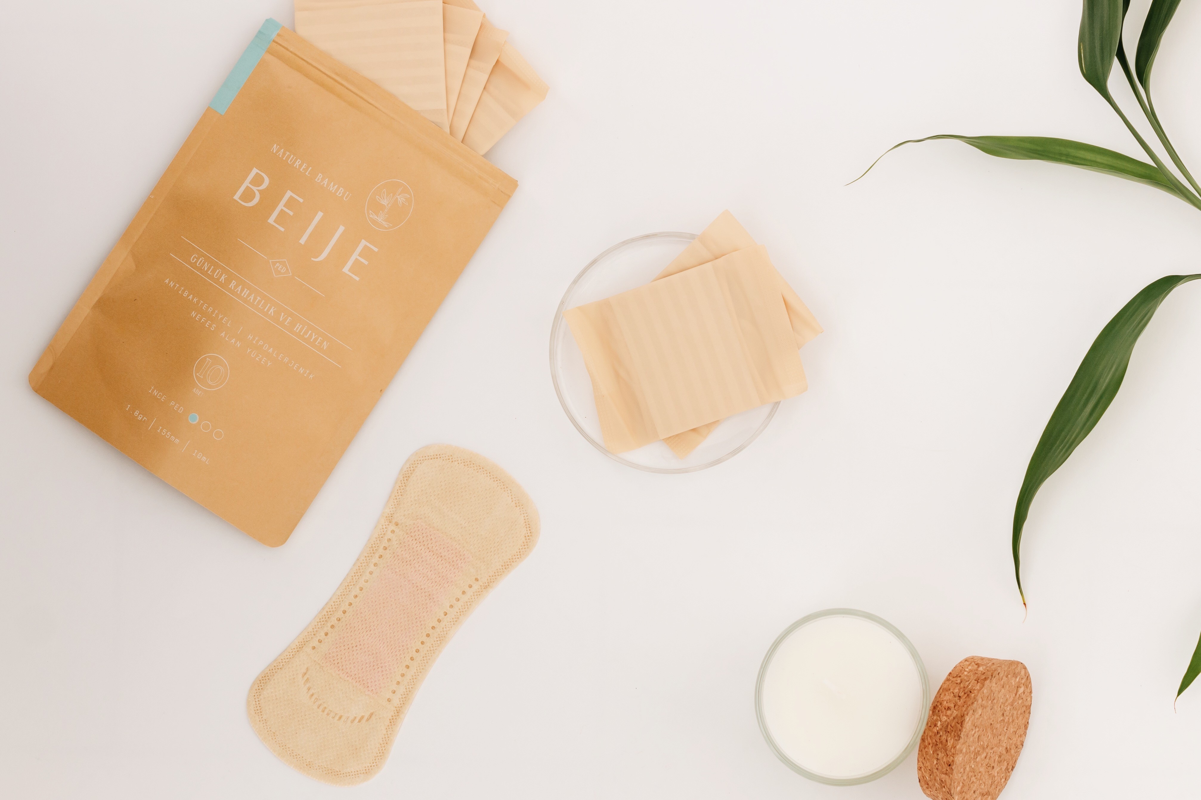
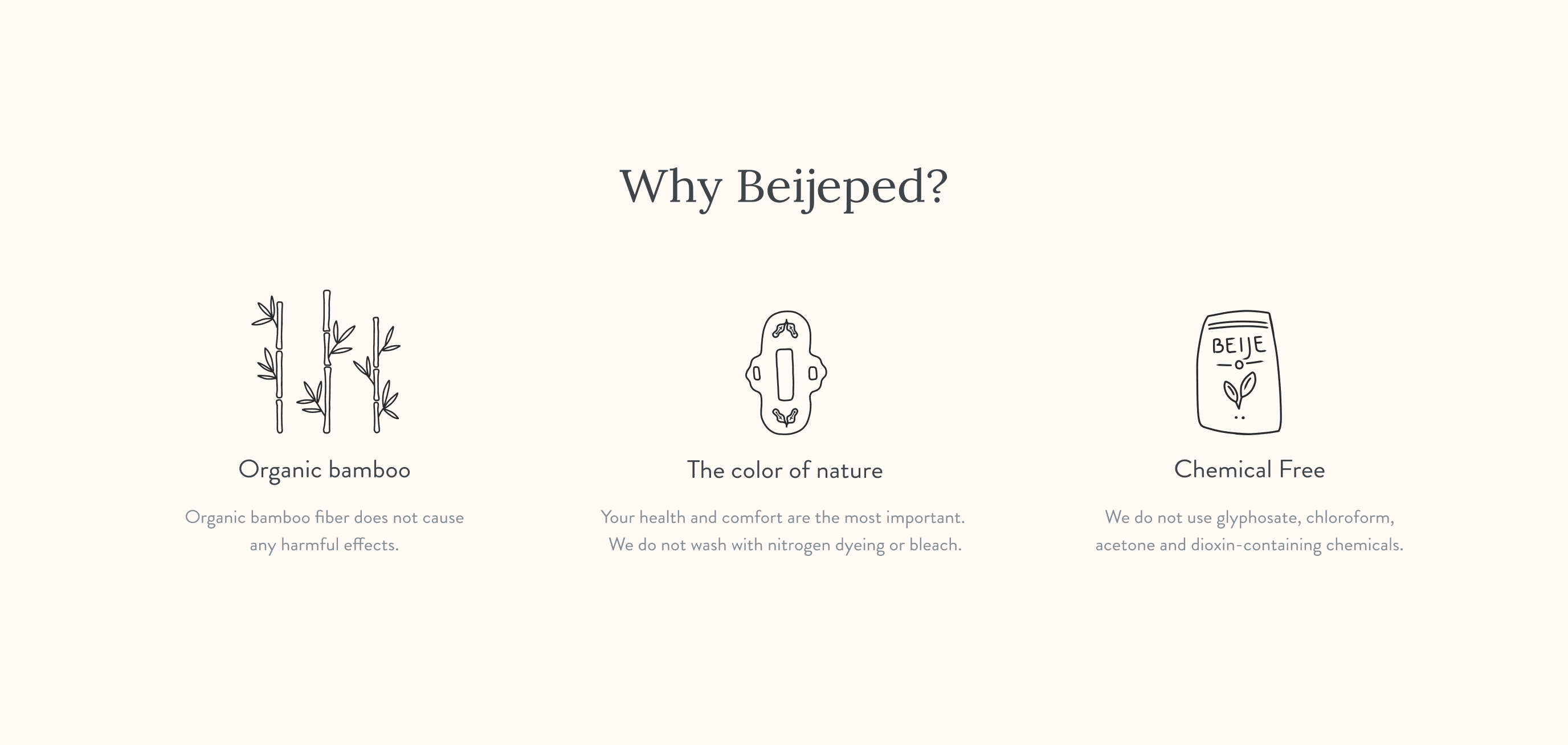
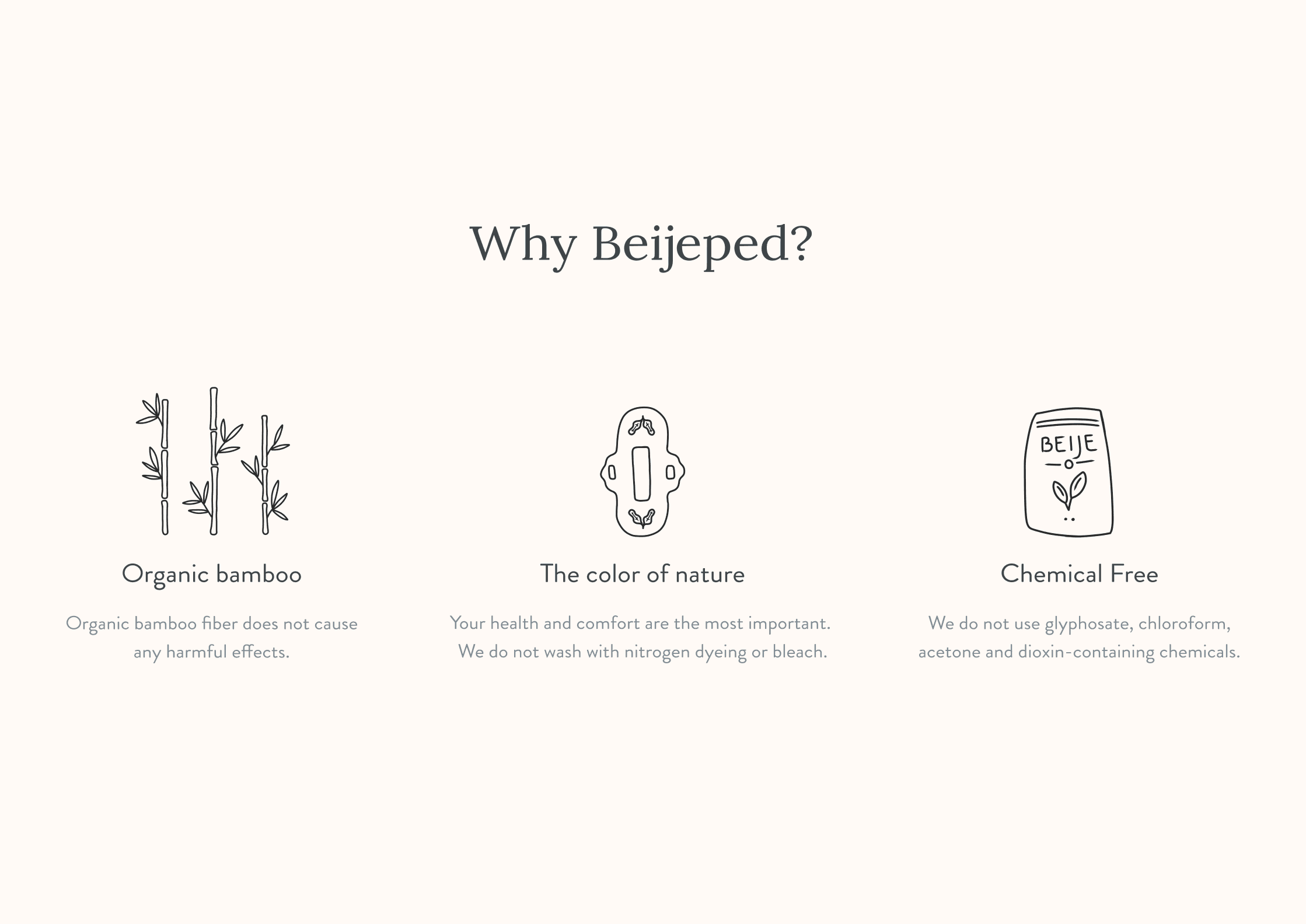
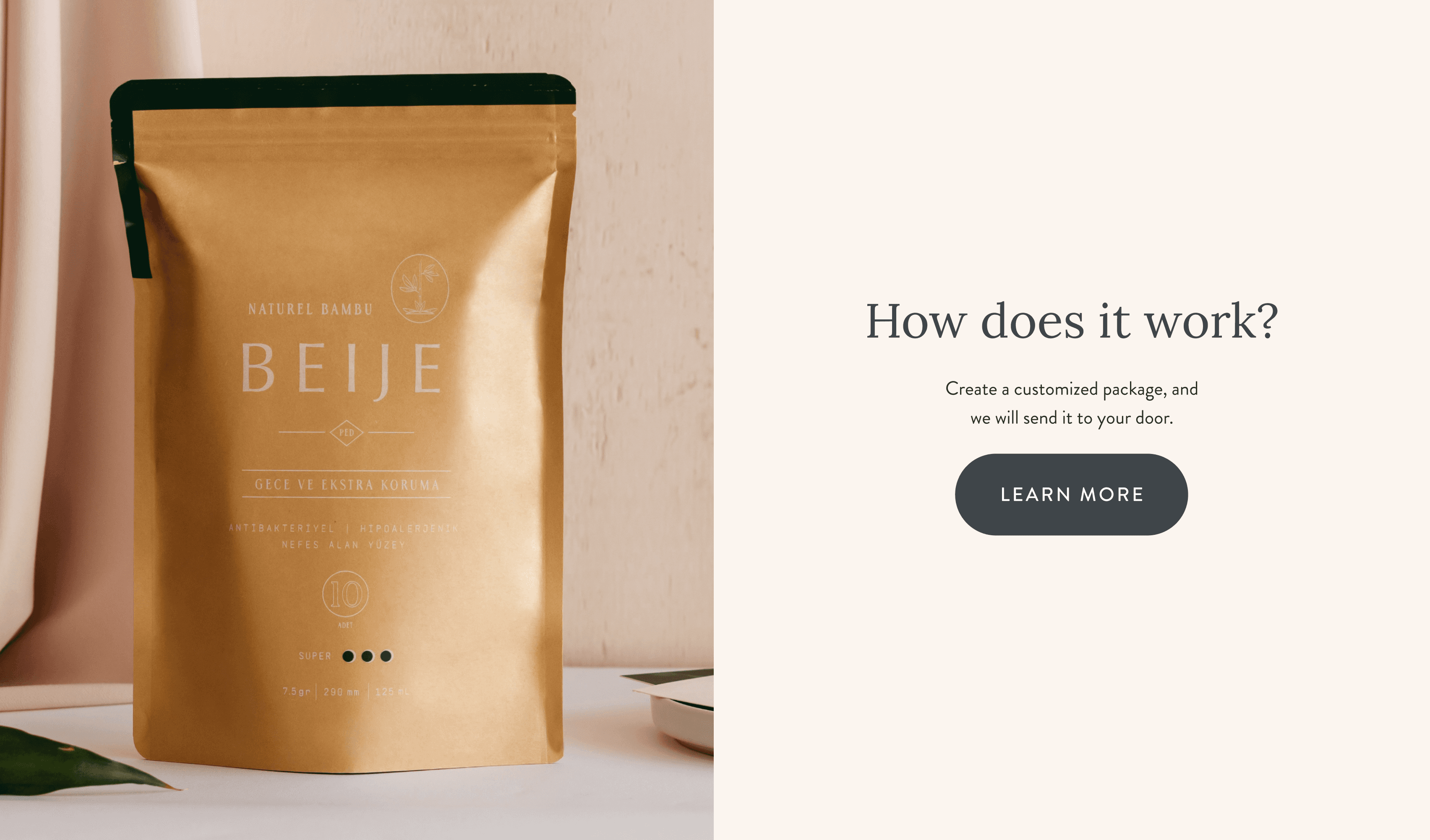
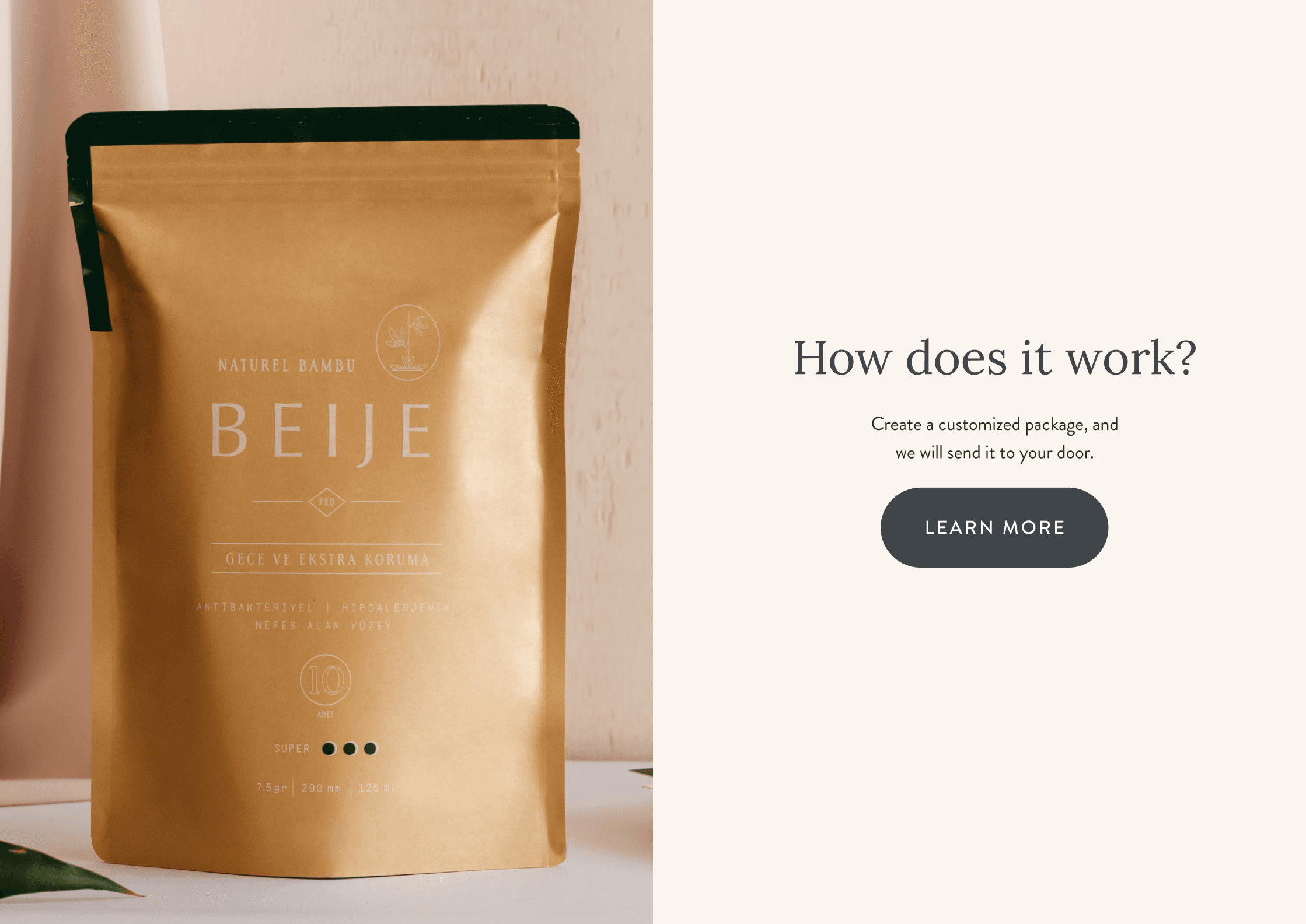
Illustrations: Custom illustrations were crafted to add a personal touch to the website. These illustrations depict women, menstrual products, packaging, elements of nature.
Case study
ux design / ui design / illustrations / color palette / typography
